"Ze zijn slimmer dan je denkt en toegewijder dan je ooit verwacht , gedreven werkhonden met een missie, scherp van geest en trouw in elke stap."
Welkom bij d'Ambrise's 's & Whitemoorborders Bordercolliekennel

Wie zijn wij? Ron Rogaar en Caroline Visser
De trotse eigenaren van dit bedrijf met een rijke geschiedenis van meer dan 30 jaar. Bij Landschapsbeheer Het Witterveld zetten we ongeveer 1600 schapen in voor uiteenlopende doeleinden, waaronder stadsbegrazing, zonneparkbegrazing en natuurbeheer. Deze kudde, bestaande uit Drents heideschaap, charollais, poll dorset en kruisingen spelen een onmisbare rol in ons bedrijf. De Bordercollies, die wij met toewijding fokken, zijn van onschatbare waarde als onverschrokken herders en partners in ons dagelijks werk. Onze betrokkenheid bij wedstrijden schapendrijven heeft ons naar de hoogste klasse geleid, een eerbetoon aan de nauwe band tussen mens en hond en onze gezamenlijke toewijding aan excellentie. Voor ons zijn ons bedrijf en onze sport niet alleen een beroep; het is onze gedeelde passie die ons drijft.
De bordercollie is een echte allround hond
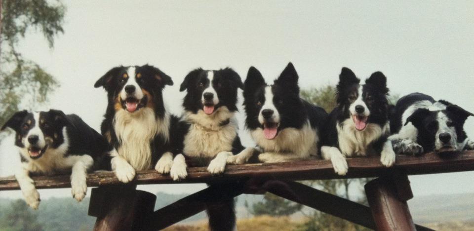
Onze Honden
Onze honden voldoen aan alle gestelde eisen voor de fokkerij van de rasvereniging Border Collie Club Nederland (BCCN) die van de Raad van Beheer op Kynologisch Gebied in Nederland. Al onze honden zijn getest op heup, -oogonderzoek & DNA bij MyDogDNA of bij
Dr. van Haeringen Laboratorium
De Bordercollie
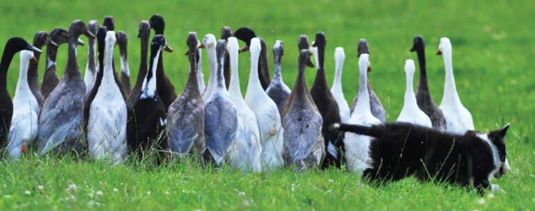
De bordercollie is bij uitstek de slimste hond van alle rassen. Het zijn leuke, intelligente en goed ontwikkelde honden. Ze zijn heel loyaal, hardwerkend en populair voor zowel het hoeden van schapen, schapendrijf-wedstrijden en of gezinshond.
Bordercollies blinken uit in alle hondensporten en zijn geschikt voor de actieve sportieve mens die graag een hondensport willen beoefenen zoals agilty, mantrailen en speuren.
Maar zijn ook geschikt voor wandelaars, hardlopers en kunnen ingezet worden als hulphond. Een echte allround hond dus.
Deze alleskunners zijn fantastische honden, zijn zeer baas gericht en kunnen fantastisch luisteren.
Onze Pups
Al onze pups krijgen een NHSB-stamboom, zijn gechipt door de Raad van Beheer.De pups krijgen bij zesde week de eerste enting en worden gekeurd op gezondheid door onze dierenarts. Zijn bevindingen worden ingevuld in de gezondheidsverklaring van het dierenpaspoort.
De pups zijn meerdere malen ontwormt. De eerste 30 dagen, na de dag van ophalen, zijn de pups gratis verzekerd door Figopet.
Onze kennel werkt met een koopovereenkomst.
De Schapen
Ongeveer 1600 schapen in voor uiteenlopende doeleinden, waaronder stadsbegrazing, zonneparkbegrazing en natuurbeheer. Deze kudde, bestaande uit Drents heideschaap, kruisingen van charollais en Ile de France spelen een onmisbare rol in ons bedrijf.
Heeft u belangstelling in een van onze mooie pups?
Heeft u interesse om een bordercollie pups in je huis te verwelkomen?
Neem dan gerust telefonisch contact met ons op. Helaas is niet iedereen of iedere (thuis) situatie geschikt voor een bordercollie en daarom vinden wij het prettig om u alvorens telefonisch met u in gesprek te gaan en u goed te informeren van alle voor en nadelen van dit prachtige ras.
Neem contact op
Witterweg 56
9405 VL Assen
Mobiele nummer
+31 6 573 279 66